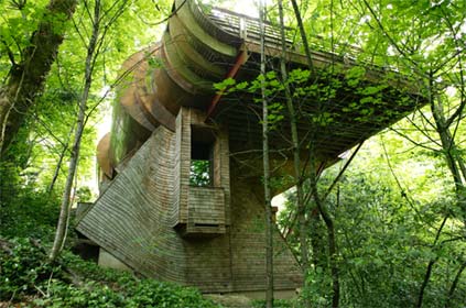
Forget what you thought you knew about architecture, because this house will blow your mind; the layout of the house, the views and the sheer architectural artistry and imagination which made it come to life.
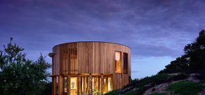
The Wilkinson Residence, designed by architect Robert Harvey Oshatz, is a one of a kind piece of architectural art. Located in Portland, Oregon, this house architecture design and location bring the main level of the house into the tree canopy to evoke the feeling of being in a tree house. I call it, the house that flows.
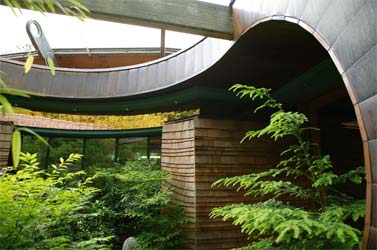
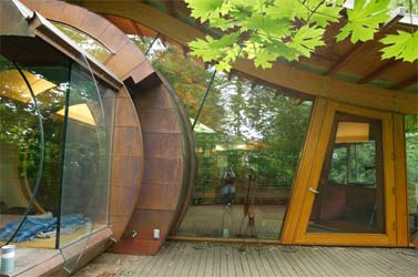
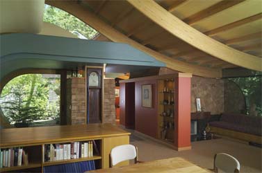
The client asked for a house that not only became a part of the natural landscape but, also addressed the flow of music. This unique design uses a natural wood ceiling which floats on curving laminated wood beams and glass walls.
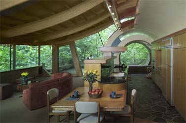
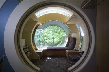
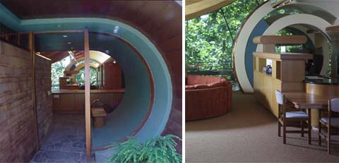
I love how the spaces in this amazing house flow inside and out – One has to actually stroll through the house to capture it’s complexities and it’s connection to the exterior; it seems as if the house almost wraps itself around you.
“An architect is an artist, creator, logician of evolving aesthetic structures; a designer of not only the visual but the internal space. I see architecture as a synthesis of logic and emotion, exploring and fulfilling the dreams, fantasies and realities of my clients, whether they are individuals, corporate, or community identities…Architecture is a synthesis of logic and emotion. When carried to its logical conclusion, a traditional design approach produces very imaginative structures. It is only a question of how much of an artist we architects choose to be.” – Robert Harvey Oshatz.
Check out Lee’s interesting comments below as he brings us an insider’s view of the Wilkinson Residence project – “I worked on this house for two years. I split time working w/ Oshatz on the working drawings and in the field managing the project and being a carpenter (including 6 months doing all the cedar shingling on the exterior and interior)…”












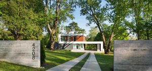
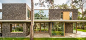
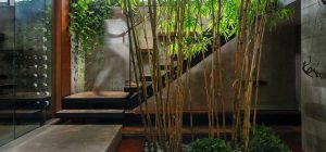
I am doing a project about shelters in woodland. I was looking at your beautiful building and wondered what materials were used in the construction to help it blend in to the surroundings while also being interesting and fairly modern in its deisng?
Hot article,very Hot.
This house seems almost lyrical in its ambiance.It seems to have a very positive energy flow
I love these kinda houses, lovely architectures, great job mate
House in the TREES! Great blend of lines and CONTOURS! Material of choice is my favorite… WOOD. This house is well dressed in radiused timber beams and randomly spaced shingle siding. This place puts you right up inside one of Portland, Oregon’s best features — its lush tree canopy! From the page: “Located on a flag lot, a steep sloping grade provided the opportunity to bring the main level of the house into the tree canopy to evoke the feeling of being in a tree house. A lover of music, the client wanted a house that not only became part of the natural landscape but also addressed the flow of music. This house evades the mechanics of the camera; it is difficult to capture the way the interior space flows seamlessly through to the exterior. One must actually stroll through the house to grasp its complexities and its connection to the exterior. One example is a natural wood ceiling, floating on curved laminated wood beams, passing through a generous glass wall which wraps around the main living room.
AJ, the answer to your question can be summed up in two words; Individual Expression. I would argue that Residential Architecture (especially Interior) is the closest Architecture gets to the level of Individual Expression found with our Fine Arts cousins (sculpture, painting, etc.). The difference is, it’s our challenge and expectation to morph our own Individual Expression with those of our clients. This collaborative individual expression (I’m aware of the oxymoron) doesn’t often translate into a wide spread love of the end result. It’s success should be primarily judged upon how well the end result relates to the clients individual expression. I can assure you that in the case of this home (the house that flows), success was achieved. I can remember Oshatz saying that one of the greatest compliments he receives is when a client says that the house he designed for them is exactly what they would’ve designed if they were an Architect.
Hey all and most of all to you Lee! I am proud to say I have come a great length since my initial post as I have been studying this whole time for my interior design program I am about to graduate from. Nonetheless I still feel much the same even if I can’t put the right words to it. The curves are very inspiring and artistically pleasing in a good way you can still live with day in and day out. But I just can’t get over the geometrical clash and drowning hues of the 70s. So you tell us, with such amazing architecture why such retro interior??
Wow, Lee – it is truly an honor! I’m so glad you took the time to clarify your point of view to our readers.
The Oshatz home did generate a lot of comments, some positive and some not so positive …but, hey, as long as they spell the name right 🙂
I worked on this house for two years. I split time working w/ Oshatz on the working drawings and in the field managing the project and being a carpenter (including 6 months doing all the cedar shingling on the exterior and interior). A friend referred me to this blog when he recognized the house and I found it very entertaining to read all the comments. While everyone is entitled to their opinion on how they’d finish and furnish a home like this (which is no small task), you cannot deny the quality of it’s space, the beauty of its form, the intricacy of its detailing, the marriage to its environment and the rigor of its construction and craftsmanship (mostly done by a crew of us in our early to mid 20’s). This type of home can only be fully appreciated by experiencing it in person. Robert Oshatz is an extremely gifted sculptor and his Architecture IS Art. I learned more about Art, Architecture and Construction while working on this house than I ever could in some stuffy corporate architecture firm, conforming to the AIA’s and NCARB’s idea of what a young Architect needs to know. I’m now in Seattle designing and building homes and while I haven’t had the opportunity to design or build a home with this level of organic freedom, this house and Robert Oshatz continues to inspire me and drive me to treat each part of a home as an opportunity to create something unique and wonderful.
And as far as this being only for the rich….you’d be surprised. It’s not in any movies I know of, but has been on HGTV. And it’s not early 90’s, it’s early 2000’s 🙂 (although how you propose to stylistically or chronologically define a house like this is beyond me).
I’ve checked the box to be ‘notified of followup comments’ and would love to answer specific questions about this house. I’m very proud to have been part of such an awesome project.
i know i have seen this house somewhere before, in a movie perhaps? i am positive it was a movie with halie joel osmith, but i just can’t remember the name.
cool. but ugly in my opinion.
Absolutely amazing. It flows so well. How do I get one that is eco sustainable as well?
http://www.aeonpi.com
Its incredible, and I think I would want one like that! Too bad I live in the desert. Anyway, the interior looks so comfortable, I would decorate differently of course, but its still hot.
if that house doesn’t scream “A RICH PERSON LIVES HERE!” i dont know what does…
sweet
There is a discrepancy between the beauty and comfort of the building, and the furnishings. Maybe they used up all their money in building it, and now have to spend some time building up a fund for interior decoration. Or, maybe they are like a lot of people: have to live in a space for a time, before knowing what will look best, where.
wow cooooooooool
Organic yet intellectual, this structure is reminiscent of Gaudi….way before the 70’s or the 90’s. He attempted to build with stone and wood structures that looked like something one would find on a forest floor or in a tide pool.
The big questions still need to be addressed. Is the house efficient? Is it a passive house that is not relying on outside sources? Is it built from local materials?
I believe that something can be small, beautiful and constructed to help the environment whatever “the look” of it is.
The inside is fine. Quit Bitching!
I hope it is in a temperate climate.
It should cost a fortune to heat inside that glass envelope.
Good job with tree protection.
The exterior design is very cool, very flowing naturalist feel…the interior should have continued the soft, rounded edges throughout the design…kind of haphazard with the curving entries and ceilings with the straight-line, sharp dividers, unimaginative bookcase, and the rather clunky table and chairs…I love the many opportunities for natural light and I do like the grandfather clock being mounted into the wall; unobtrusive, yet providing a section of ambiance for an otherwise uninteresting wall…the exterior is a 10, interior a grudging 7…
Architects design houses with few walls here and there, but an artist creates emotions and makes it home.
Thnx…its very inspiring to find such creations online
🙂
Reminds me of Quark s Mom s house on Ferenginar on Deep Space 9.
Yes cool. For sure he is fan of Frank Lloyd Wright!
Beautiful shapes inside and out. Sure there are interior finishes (crazy paving in the kitchen, really?) and furniture choices that you’d change based on personal taste, but it looks incredibly comfortable and enjoyable to inhabit, which is kind of rare for such an extreme external architecture.
REALLY COOL!!!
looks like the space shuttle
We all love this house beautiful flow of energy totally Fung Shuayed out…
Have a Great Day!
Namaste!
Sonia Novick
Your Multidimensional Coach and Mentor
WEB: http://www.Beyondtheliving.info
WHY?
“Ten dollar haircut”, LOL!!!! That is too funny. And a walmart! You guys are a riot! hahaha!
Cool house!!! I read another post here and it made me think…. I will be happy if you share your thought …..
https://www.busyboo.com/2008/07/31/small-houses-better-life/
it’s a great concept.but looks too 90’s to me too.Id make it minimalistic.or more organic, simple . nice though.
now if they put a super walmart next door or something like that, these people can live like most of us….
actually, kind of looks like a 10 dollar haircut place
Aslo… Grandfather clock?? Sorry this is wayy too 70s for my tastes.
I love the overall design and feel of this building but the interior design is a real let down.
Whole the currently trendy soulless minimalism would be just as out of place.
Mixing the diefferent woods of the furniture seems also to be a fail. Also the flooring could be long planks rather than the 70s nightmare crazy paving. Cold on the feet too.
I think the interior desing would benefit from the use of flowing curved shapes. The standard shapes of the cabinets and bookshelves realllllly seems out of place.
Caffrey x
I wanna own that house, Im pretty sure my skater friends will love my parties!
Seriously though, its a pitty the interior decoration isnt up to bar, the outside looks very harmonic.
kind regards
gix
Yes, the interior looks nothing like the soulless, sterile minimalism that is currently trendy. That automatically makes is hideous (not).
I absolutely love this home, however I think the interior design could have been a little more in tune with the exterior. If the intention was to look retro, mission accomplished… just not with as much style as I would have imagined!
the outside rocks, and the inside is decorated like a classroom or something…it’s no good
Seventies, yes. Art Deco??? No way. Not even close.
I love this house mostly because it makes me feel like a kid again. It’s beautiful.
I absolutely adore the outside, but the inside is hideous! It looks like 70’s retro yucky art deco. Ick.
this did not blow my mind. in fact its very early 90’s
Isn’t it loverly…. where do I get the blueprints…? Building something like this would be a labor of love….very, very cool…
Agree with Jim, this is a work of art….
Hey me-mo,
To me, this is a piece of art and as much as I love prefabricated houses, not every architectural design should be referred to as a mass production prefab alternative.
You can’t take it with you, but you sure can enjoy it while it lasts…
Uh, I LOVE IT. I ant it for my own.
That’s really cool but,the cost of having something like that designed and fabricated puts it way out of the”average”guy or family’s price range.But then again if you have the money,what the hell.You can’t take it with you.