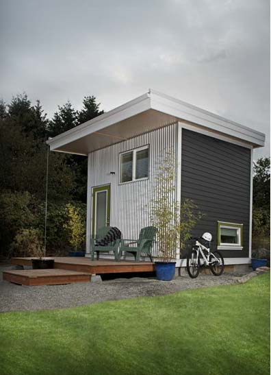
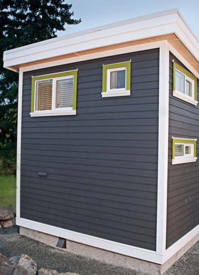
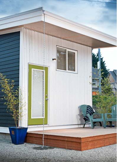
Based in Vancouver Island, British Columbia, Twelve3 do small in a big way. Their collection of micro homes, or should we say Cubes, are simple, convenient, and oozing with style. These small, sustainable homes feature approx. 1700 cubic feet of space, with plenty of natural light – Living small doesn’t mean you need to compromise.
Cubes can serve as small homes, guesthouses or rentals, or studios for all types of creative work. Each home consists of four distinct sections:
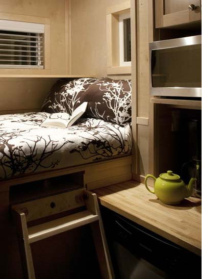
Living area which includes a comfortable couch/guest bed, a handy slide out storage compartment, and a spacious work surface serving as a home office space.
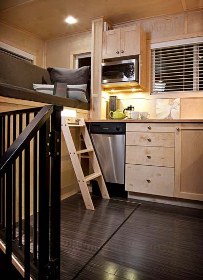
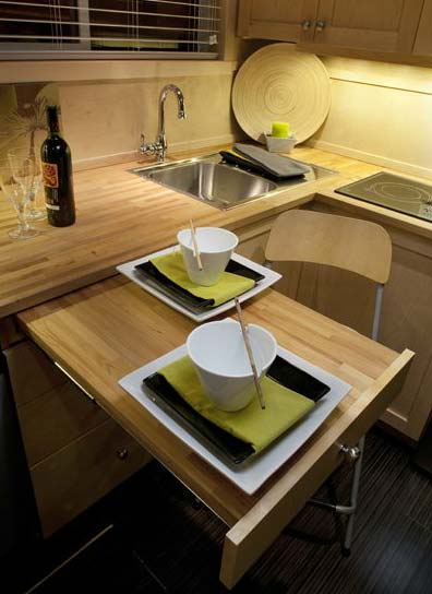
Kitchen with a large window, extensive counter space with smart under the counter lighting and wall-mounted cabinets, a stainless steel sink, fridge, propane cook top and options like a dishwasher, induction cook top, microwave or grill oven.
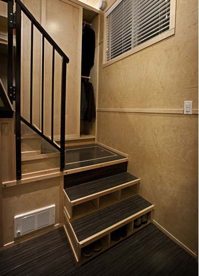
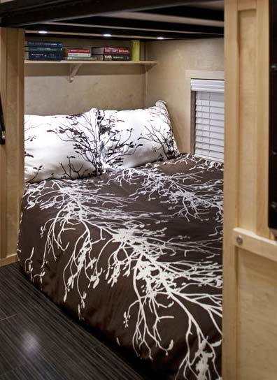
Bedroom with a seven-foot high closet and extensive shelving with loads of storage space.
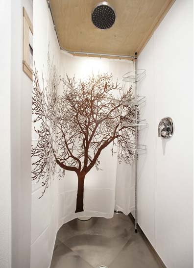
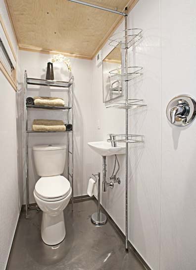
Bathroom with a full size shower, sink and water saving low-flow toilet, stainless steel floors and an on demand hot water heater.
All of the windows and doors are double pane, interior is finished with pre-finished birch and one priming coat of paint, lumber is largely FSC certified, and all lighting units use low voltage LED or micro bulbs.
“We believe that high-tech housing can be affordable, sustainable, and packaged into a small space that remains practical and comfortable.”










Magnificent web site. Lots of useful info here. I’m sending it to some buddies ans also sharing in delicious. And certainly, thanks to your sweat!
This is a nice and cozy design. It has an interesting interior with a flow about it. And the exterior is very nice looking. I like the clean lines and how the sides are different. It gives it an art deco type of feel.
I could see myself living in this. But it has to be affordable. Very good job.
Last year, before I deployed to Iraq, I was hooked on this modern cube design, which was created by this English woman. The structure was somewhat similar to this, but not heavily detailed, as the layout on this design. Her cubical living area was more like a one bedroom type of deal.
The twelve3 is now my favorite design. It captures every living condition that you would ever need in a much larger existing home. Its features are that simple, but seem to work within the living conditions of that specific interest.
For some reason, I just keep coming back to see this crazy layout. What really catches the eye is, how it doesn’t carry an odd shape to itself, but gives off a low key reassurance. There’s not a whole lot that needs constant reinvesting. Plus, it’s personal and allows plenty of personal space.
I know what you mean, Greg.
Maybe it’s the coziness and comfort that we feel when compact spaces are concerned.
What is the twelve3 that you’re talking about??