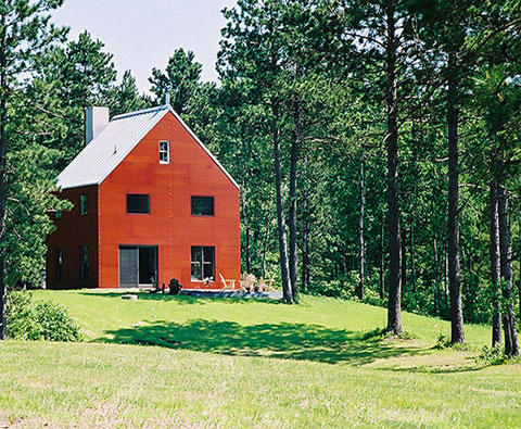
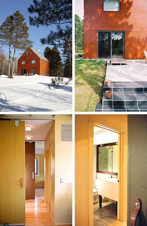
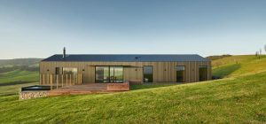
When I look at the pictures of this house I forget everything. Something happens: I’m feeling inspired. This is the magic of architecture, the magic of design. As it can also be read on the architects’ original description of the house, it is iconic. It is called the Barn House I. First of all, the proportions are iconic. It is a regular cube, with a square lay-out. The roof has an incline of 45 degrees.
The outer appearance of the house is very laconic. However, it doesn’t look like the house was meant to be small or minimalistic. On the contrary, the house feels generous in volume. I’m not sure of the exact size, but I suppose the construction area is no bigger than 530 sq. ft.
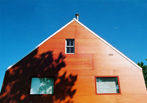
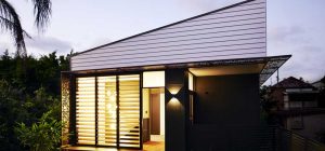
Each of the elevations feature two openings on the ground floor and two – on the first floor. Yet, one of the facades stands out among the rest because of the huge chimney, which is a staircase in reality. A roof window in the staircase roof is made in a sweet, but laconic manner and stands in contrast with the traditional gable window.
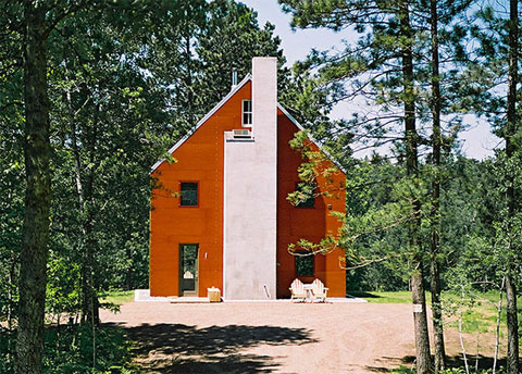
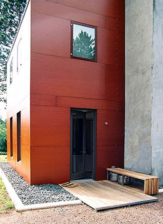
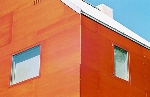
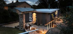
The exterior surfaces of the building are covered with reddish siding, cut into rather large sheets. The volume of the staircase, which is left concrete-like, cold grey, contrasts mildly with the rest of the house body.
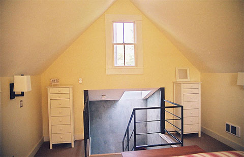
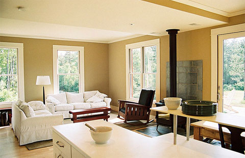
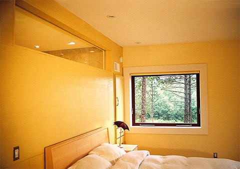
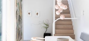
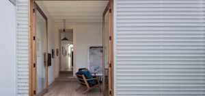
The interior design also shows that beautiful things are valued here. For example, the interior space of the living room and the stair hall upstairs are eclectic, no too modern, with some classic elements (olive or ivory wall color, white molding around the openings and at the ceiling-wall edge), some rural elements (wooden table) and lots of modern accents (dark inner walls of the stair case, black railings, laconic windows) – all very tastefully made!







share with friends