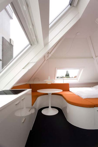
Is it possible to live comfortably, stylishly and spaciously in 30m2? Most would probably quickly reply, no. But when clever and creative interior design enters the equation, possibilities are born. The Maff Apartment is an exquisite example of that.
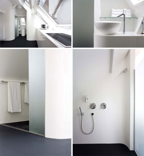
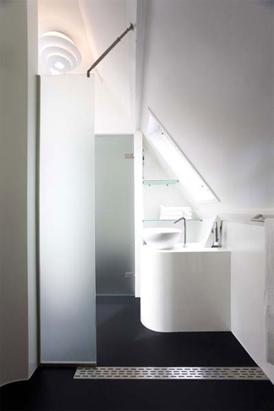
Designed by Queeste Architecten, this apartment is located in a small attic in the Netherlands. Equipped with a kitchen, full bathroom, living and sleeping area and adequate storage facilities, this attic space becomes independent from the rest of the home. It’s perfect and comfortable for a single person or a close couple. If you’ve been wondering what to do with your attic, this might be a fun project. If you rent it out, it could provide a little extra income too. Maybe even a new friend or two.
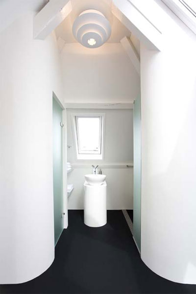
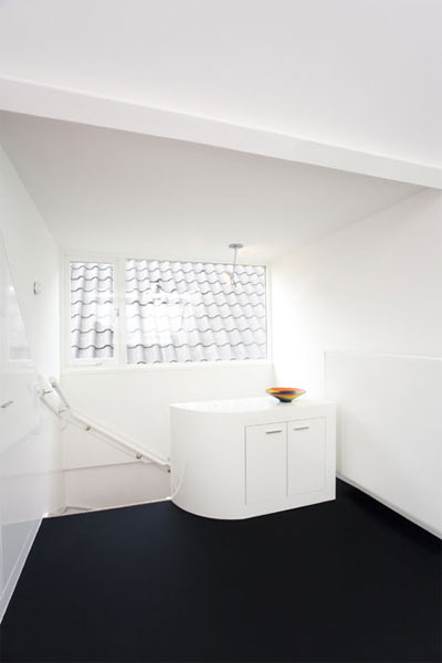
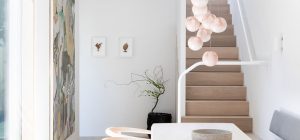
The key to making this space look and feel spacious is maximizing the light. Large windows and white surfaces do the job well. The windows let in the light and the white reflects it all over the space.
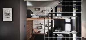
The clever layout is also a very important factor to making this space enjoyably livable. Multi-functionality, efficiency and flow are concepts that have been clearly kept in mind, especially apparent in the sleeping / living area. The curve of the orange sitting surface allows for a separation of activities; sleeping or dining/working/chilling.
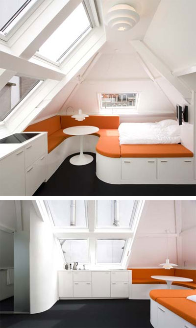
I love how the designers used lots of rounded edges to soften the space. Straight lines in such a small space would be so severe and unfriendly. The anthracite epoxy floors are pretty gorgeous too. One has to appreciate the pop of orange against an otherwise achromatic interior palette. It gives the space a lively appeal. They chose this warm orange color to reflect the characteristic orange rooftops of the area. I really appreciate that design choice. Just because the interior design of a space is in question, doesn’t mean we shouldn’t try to relate it back to its exterior environment. This kind of coherence affects us on an unconscious level and promotes harmony.
For all these reasons and more, I find the Maff Apartment such a wonderful and well designed little space.
Architects: Queeste Architecten
Photography: Teun van den Dries








we can not see the facad of building , but idea is great .
I thing Black color on floor .is able to show all dirty .
a little , spot color may be good idea,
please send me more photo .
Best Regards