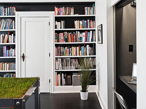
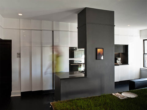
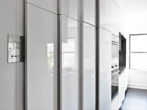
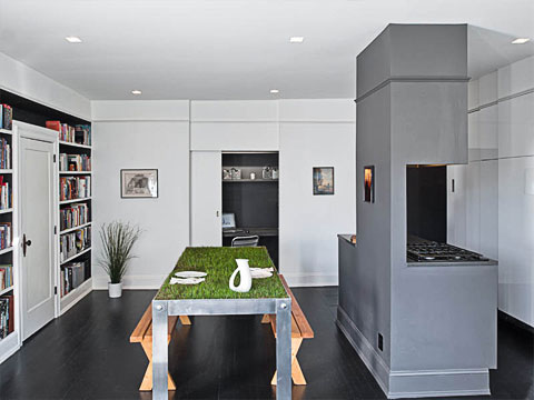
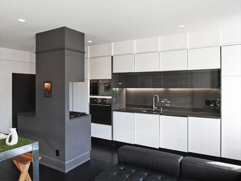
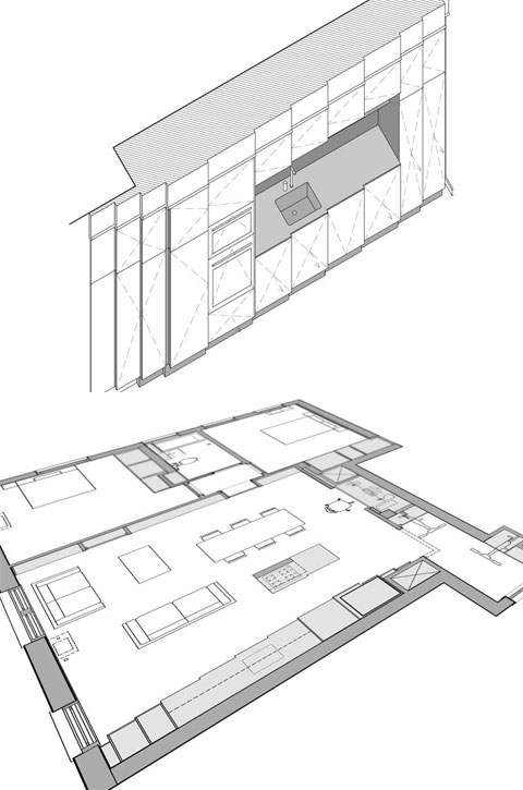
This New York City apartment really intrigued me. Renovated by Haiko Cornelissen Architects, the goal was to significantly increase the main living space by compressing other functions (like kitchen and office) into the wall of the apartment. They achieved this using a system of siding doors and creatively concealed storage solutions.
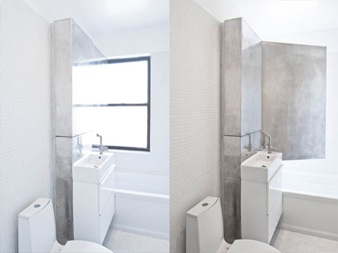
In the bathroom, they use a reflective wall finishing to reflect light, therefore enhancing the illusion of space. This renovation design is a great example of how to adapt charming old apartments for the modern lifestyle. A true lesson in space management.
I love that the basic color pallet is white, black and grey. Everything is quite sleek and streamlined. You get the feeling that everything is pushed back and the small amount of colors pop out. The bookshelf wall is a great example of that. The black background recedes and therefore, the books really come alive. And what’s up with that upside-down door, you ask? Actually, it hides the media center. I think its pretty fun.
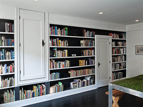
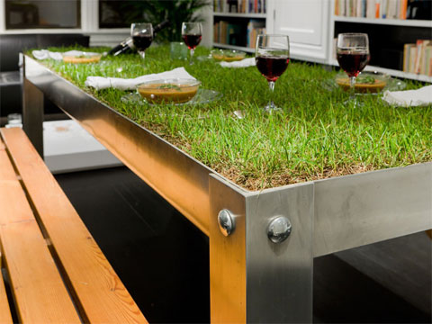
Overall, this contemporary, NYC apartment is quite an inspiring space. Its design offers a variety of options and choices for daily functioning. A design picnic, one could say – much like the daily picnics one could enjoy on that grass top dining table, right?
Photos by Alan Tansey









share with friends