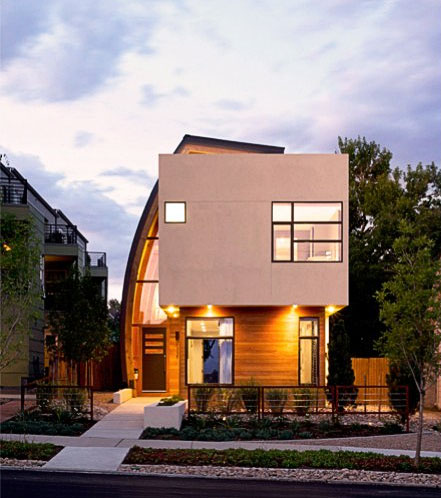
There’s often a distinct design feature about a building. This mighty feature works in exterior as well as interior spaces and holds the entire design concept of the project. Everything else obeys to its power and doesn’t violate the hierarchy.
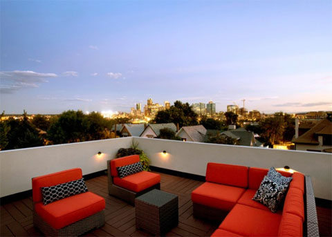
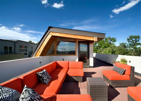
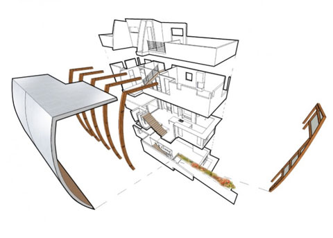
In the case of the Shield House in Denver, Colorado, such highlight is undoubtedly the form and the structure of one of the side elevations. This side wall is not straight, but follows a curve, ending up at the top of the building with an additional roof and with an exit to a splendid roof terrace.
This curved structure decorates the main volumes of this 3000sq. ft. home. The volumes themselves are far more modest in their form (basically – a cube), hosting an entrance zone.
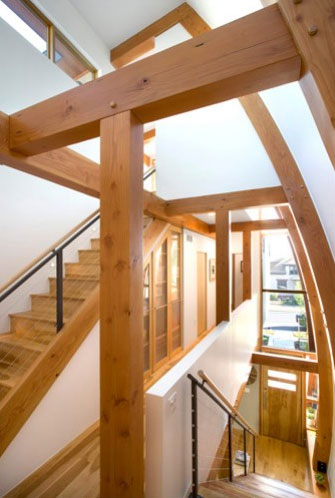
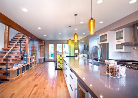
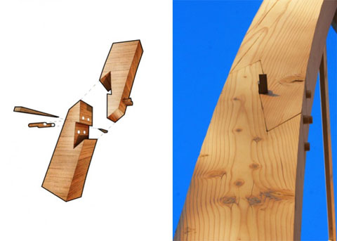
This entrance zone volume is not at all less interesting from the interior point of view, as all the structural wooden elements are exposed in the inner space (staircase) and provide – together with white coated walls – a fascinating, yet rustic interior design.
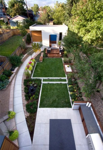
The concept of a curve-versus-rectangle contrast is the primary keynote of this house, which can also be seen at the landscape design of the yard behind the building.
However I’m coming back to where I started – the main facade with its “welcoming sail” (as described by the architects themselves). Although the entire house is impressive from a design point of view, the appearance of the main elevation remains the most powerful feature of this beautiful project.
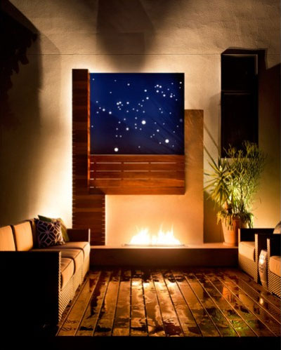








this is just uberly amazing!