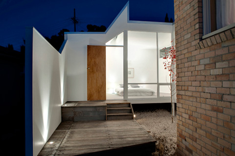
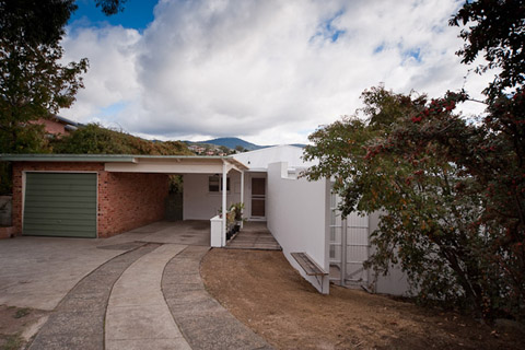
In Hobart, Australia there’s a new extension connected to a 1970’s brick house. This type of architectonic surgery needs to be dealt with responsibility in order to keep the careful balance between old and new. And in this particular case of the Dual Court House, I think its fair to say we have a winner.
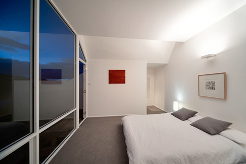
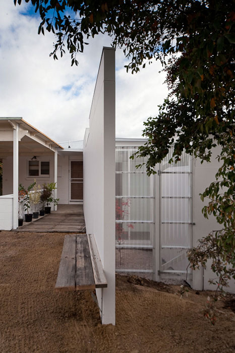
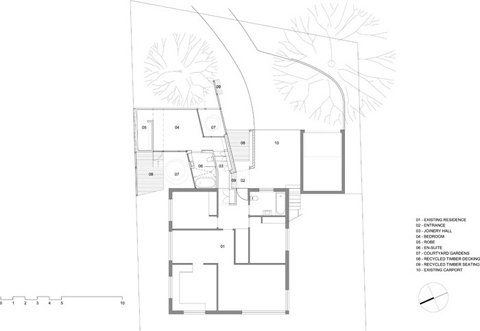
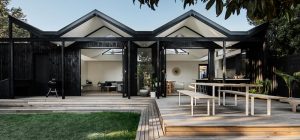
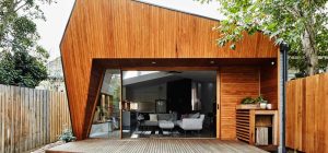
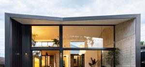
This modern house extension is formed by a bedroom, courtyard and dressing room wrapping around a north-facing garden court. The new addition is placed in the front yard, occupying an unused open space and linking back to the existing house via a hallway and an adjacent bathroom. A white wall encloses and conceals the extension from the street, intersecting the existing house to form an entry sequence.
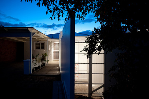
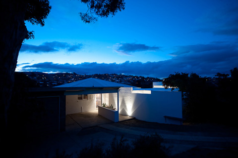
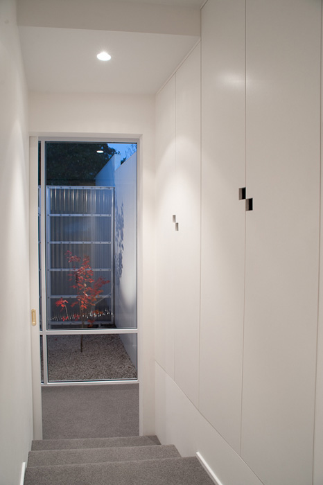
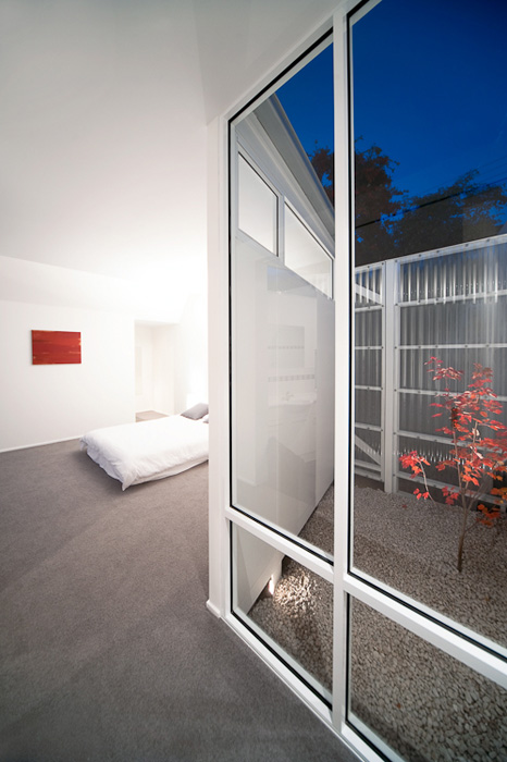
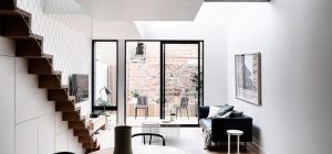
Internally, the plan is defined by two spatial moments that establish a dynamic in movement between old and new. The first is at the entrance, where a white cabinet leads into the existing circulation space, providing a space for storage. The second is created by a small courtyard, which acts as a turning point between circulation and bedroom. This enclosed outdoor space provides a filtered view to the front yard via a clear, polycarbonate screen.
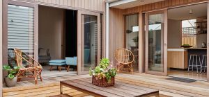
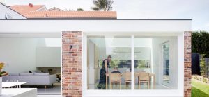
In this house extension, new means white painted surfaces while old means exposed brick. Only recycled timber, used for decking and seating seems to reinforce the unity between the two…
Architects: Bloxas
Photography: Jonathan Wherret












share with friends