Imagine having the freedom and luxury of combining two apartments in to one bright spacious home. Wonderfully designed by Studio Karhard, this home’s seemingly non-chalant choices are deceptively well thought out. My first signal that there’s great design is that it feels effortless so let’s break down their formula.
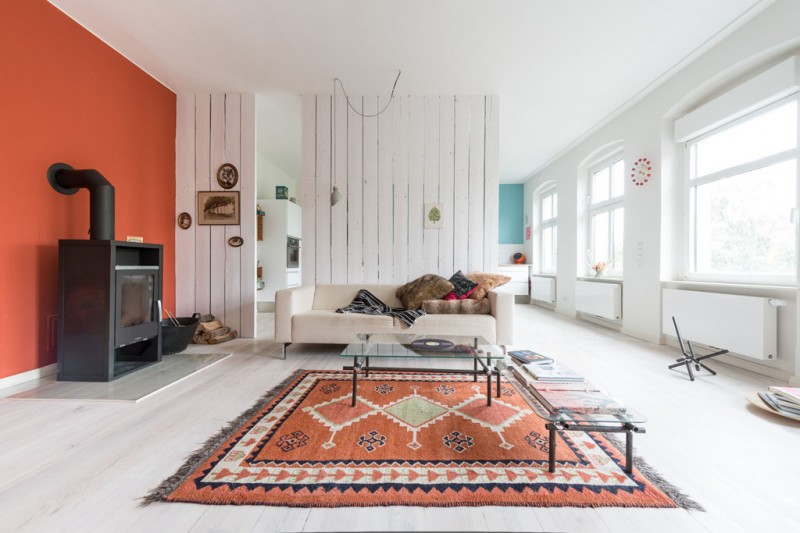
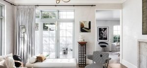
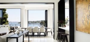
First emphasize the strengths that exist. Wide plank wood flooring has been white washed and unites the public living spaces. The kitchen, dining, and living areas face the enormous wall of windows. In fact every room has at least one large window.
Second, allow spaces to flow freely together for a feeling of spaciousness. Here the living is moderately separated from the kitchen by a remnant of an original dividing wall, which has a character all its own.
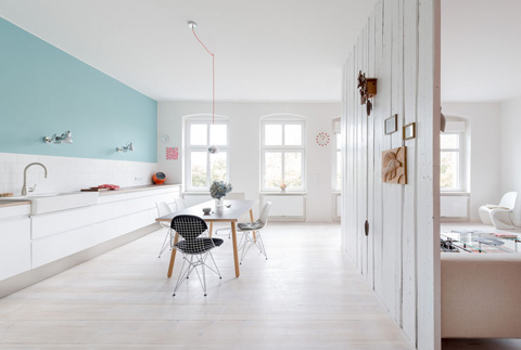
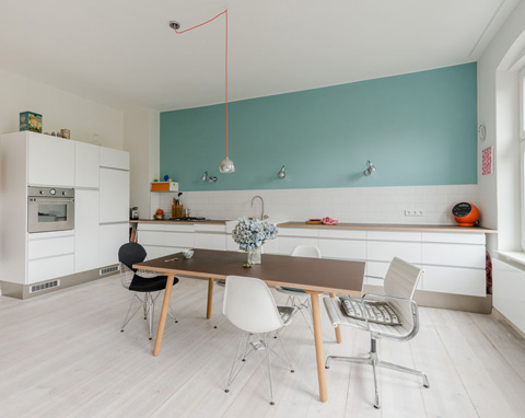
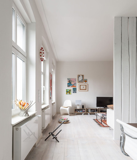
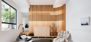
Third, blend furnishings with character and different personalities and splurge where you can. Here they’ve used some style icon pieces such as Eames Eiffel chair, and Vernor Panton chair that are always comfortable conversation starters.
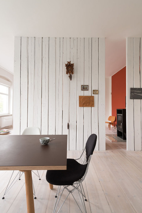
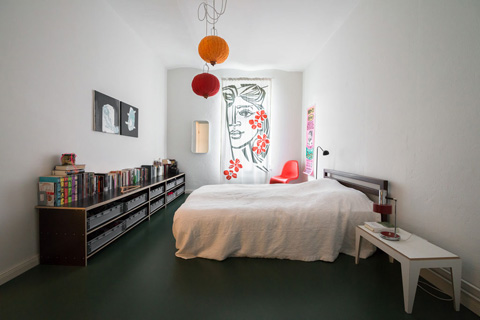
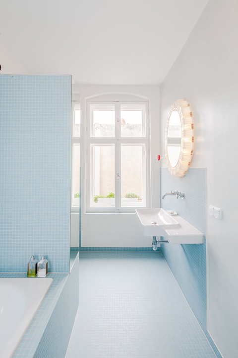
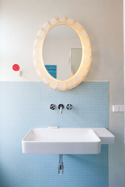
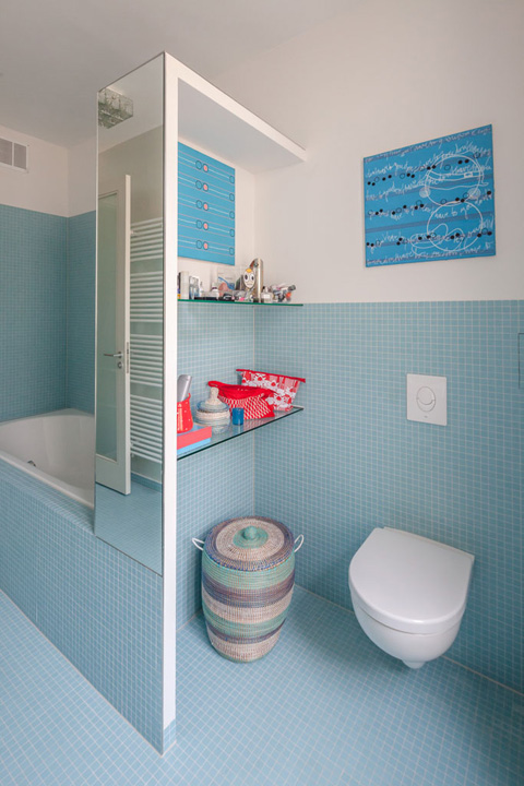
Fourth, use pops of colors that play well together. The complimentary color scheme of blue and orange, one of my personal favorites, brings life and vibrancy to the rooms. Notice how it’s carried throughout in different ways, from draperies to the fresh tile in the new bath.
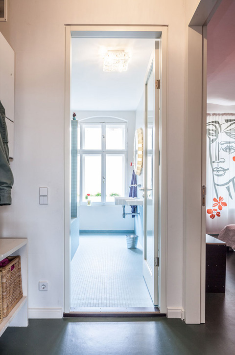
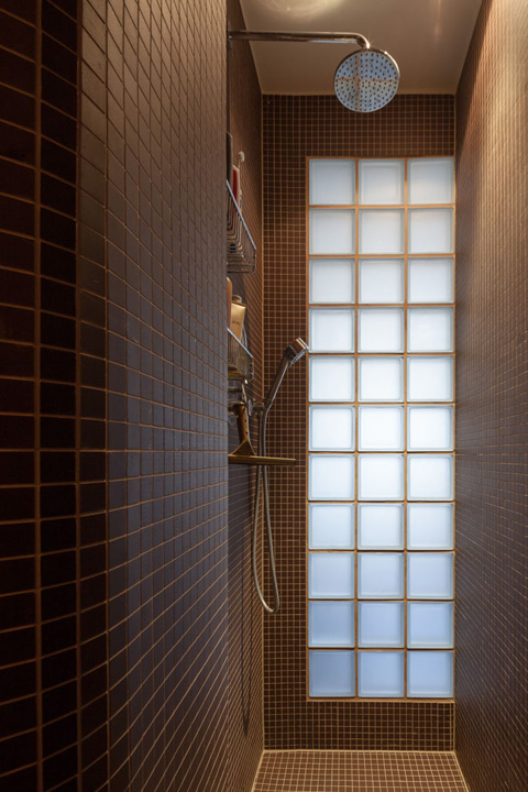
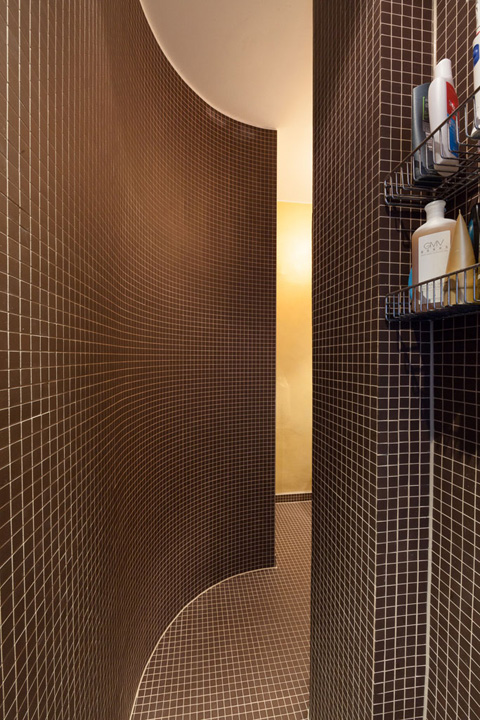
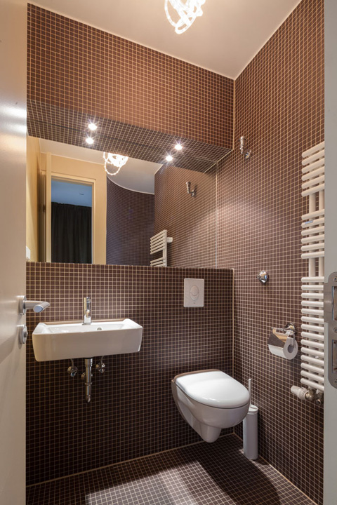
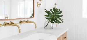
Fifth, try new arrangements of fixtures and plan shapes. In one new bath the shower has been pulled out of the far corner and one wall drops away from the ceiling to allow day light in. The second bath is entered through a curve that is tiled on the inside. Glass block in the shower borrows light from outside without sacrificing privacy.
Design: Studio Karhard
Photography: Stefan Wolf Lucks









share with friends