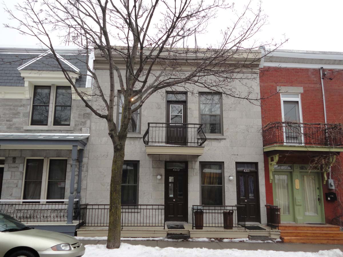
Well-designed and perfectly executed transformations are an inspiring lot. Imagine what lies beyond the traditional stone facade of this 1920s duplex. The client and Naturehumaine architects designed a home through a remarkable study of geometry clad in an austere palette.
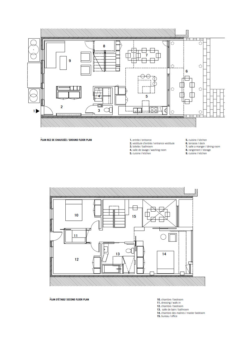
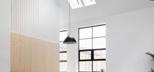
Formerly leased to tenants, the Quebec home now boasts a seemingly expansive first floor living space and three bedrooms, baths, and work area upstairs. The volume is achieved through a central stair that emanates light from above on all sides.
Storage is tucked under the lower wooden stair run, guarded by black geometric steel and glass on one side. A floor to ceiling two-way book case ensures safety on the opposite side. Shelving radiates from every other stair tread. On the second floor, the book case stays low to wrap the diminutive work space.
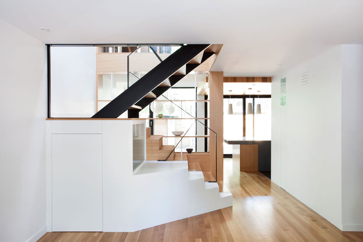
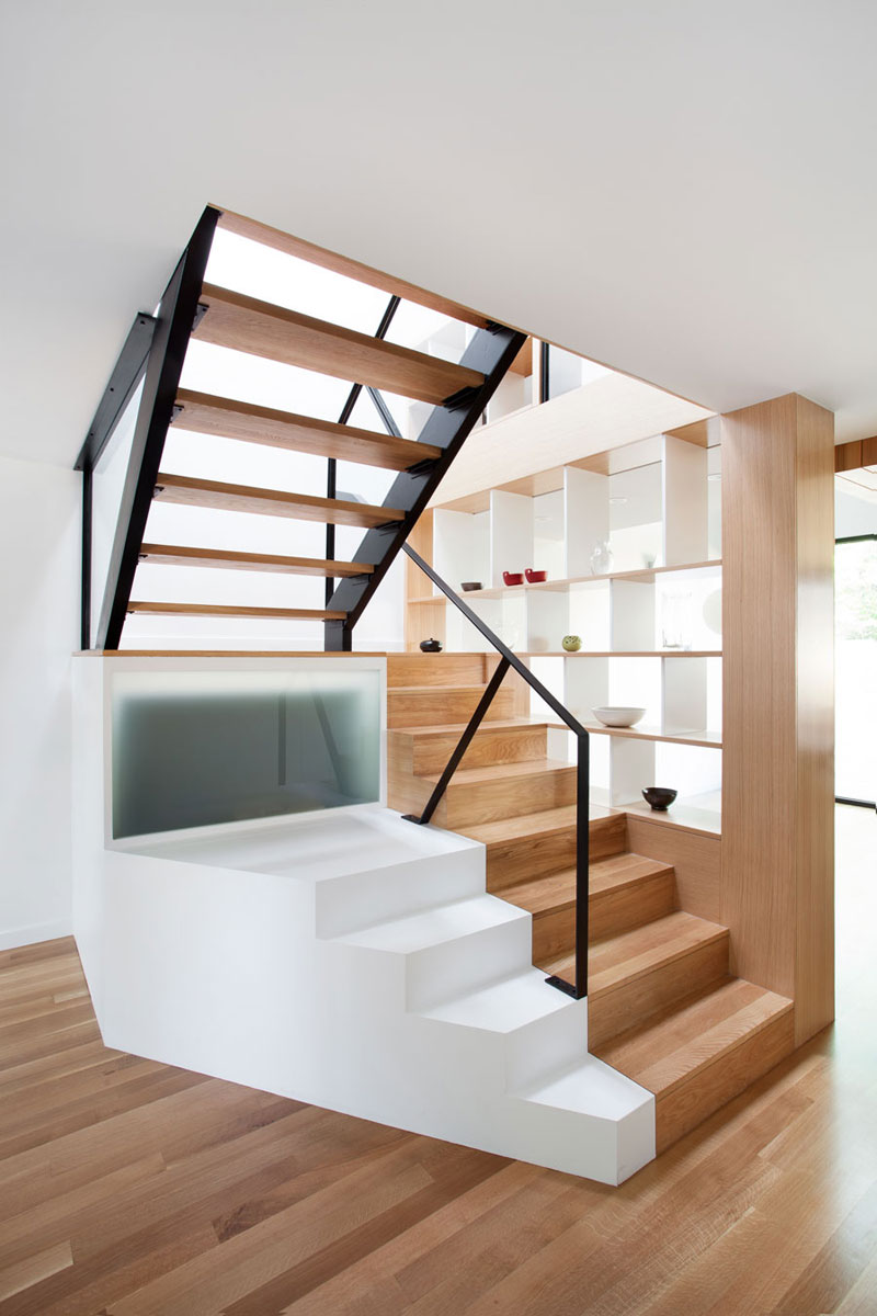
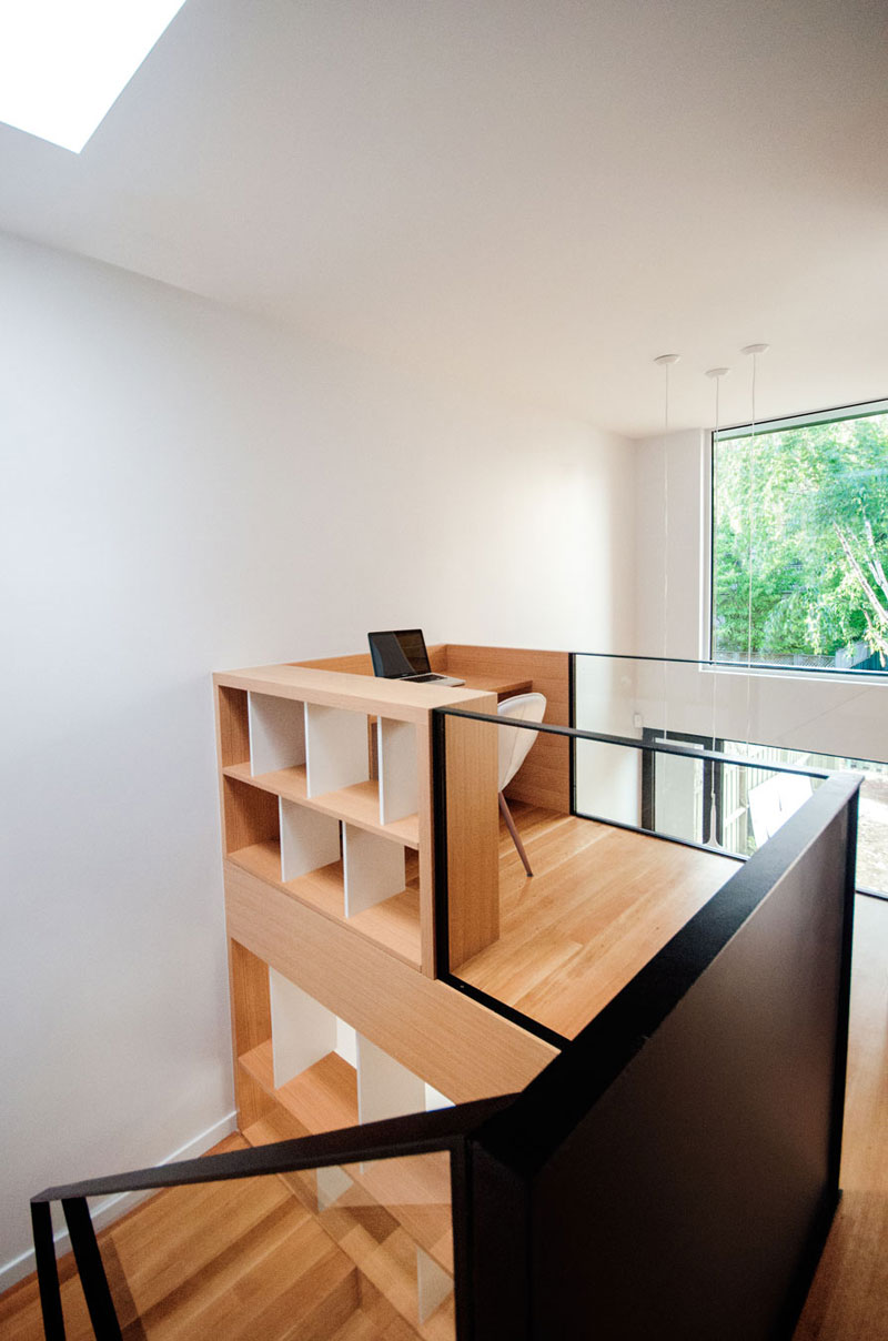
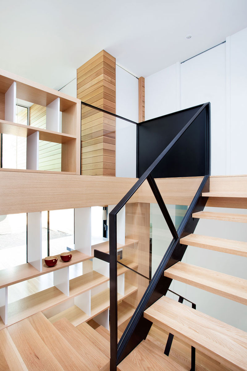
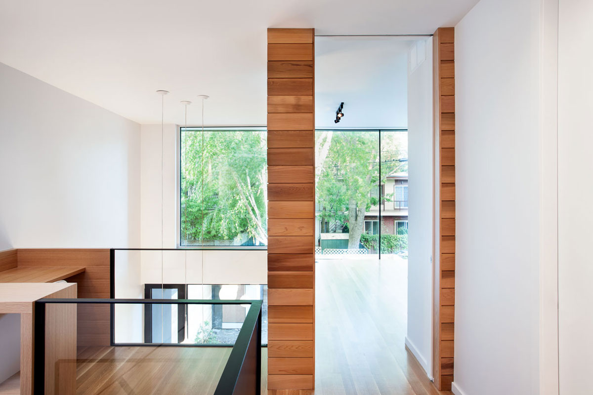
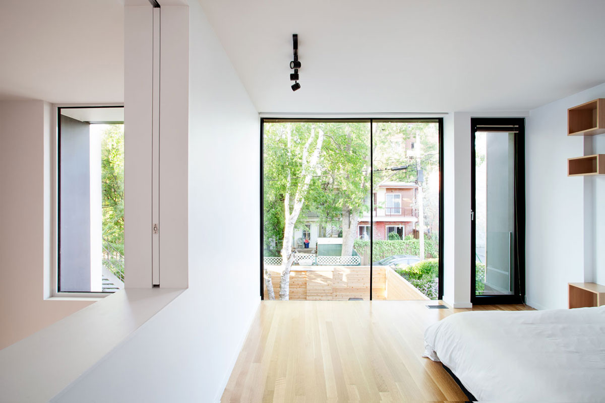
The lofty space overlooks the dining room and the glass guard there again promotes light distribution. Even the main sleeping space shares light with the two-story dining area below. Just slide the solid partition across the opening for privacy.
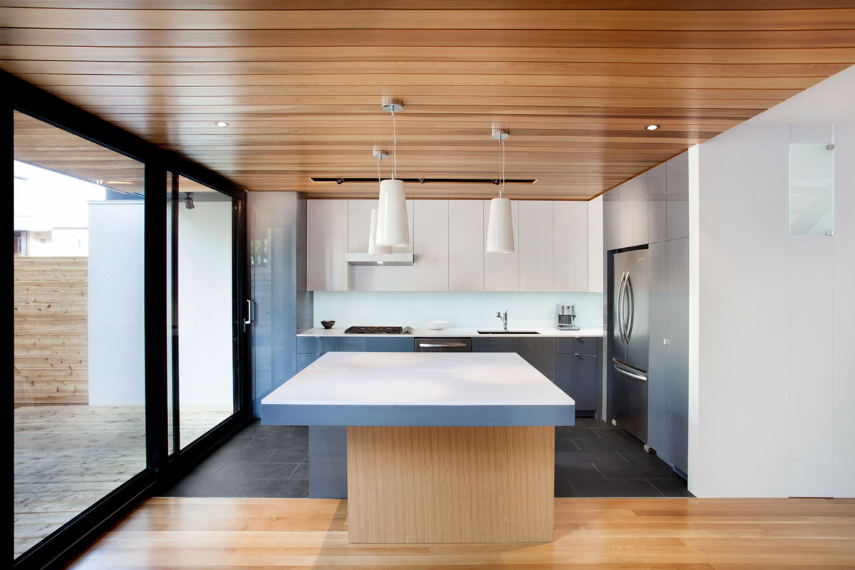
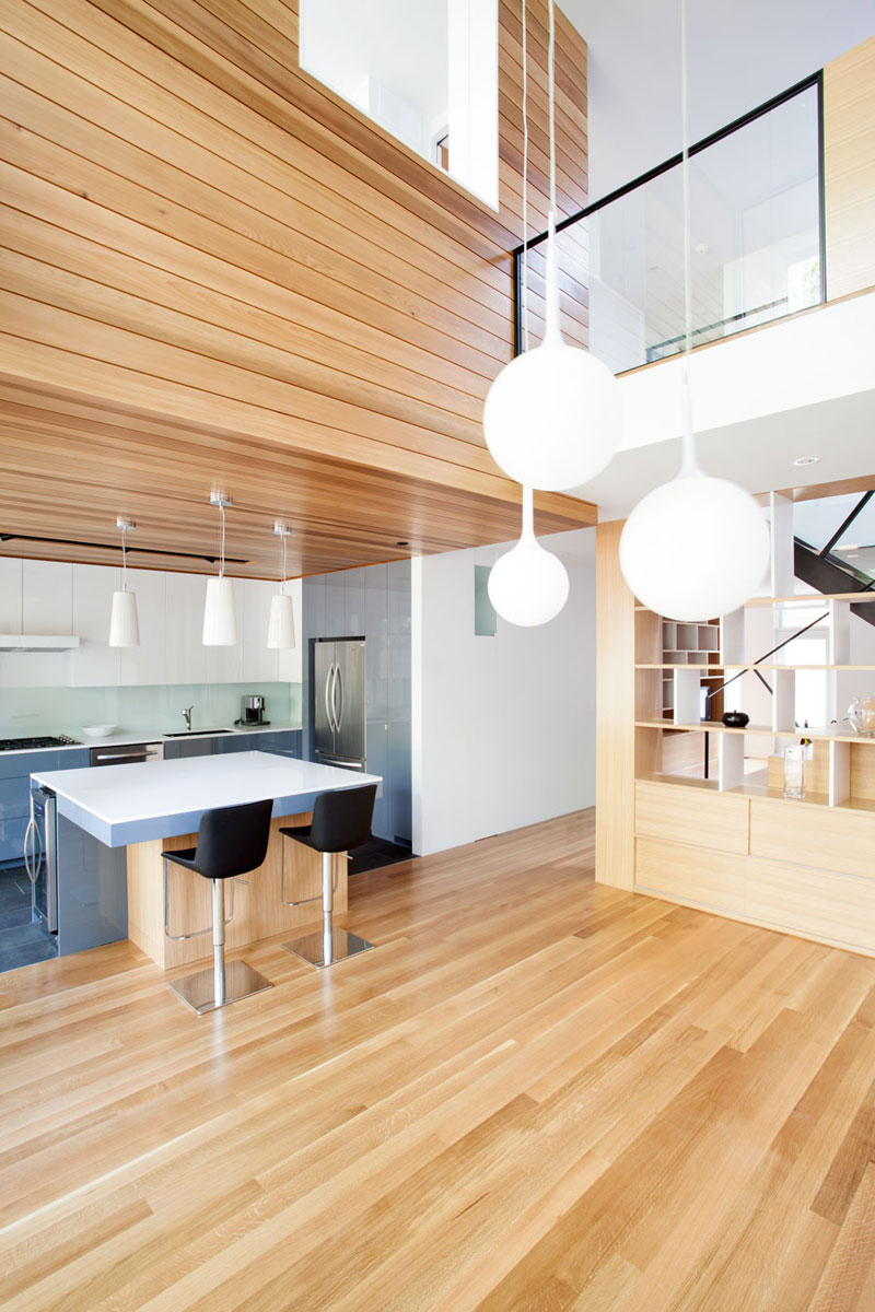
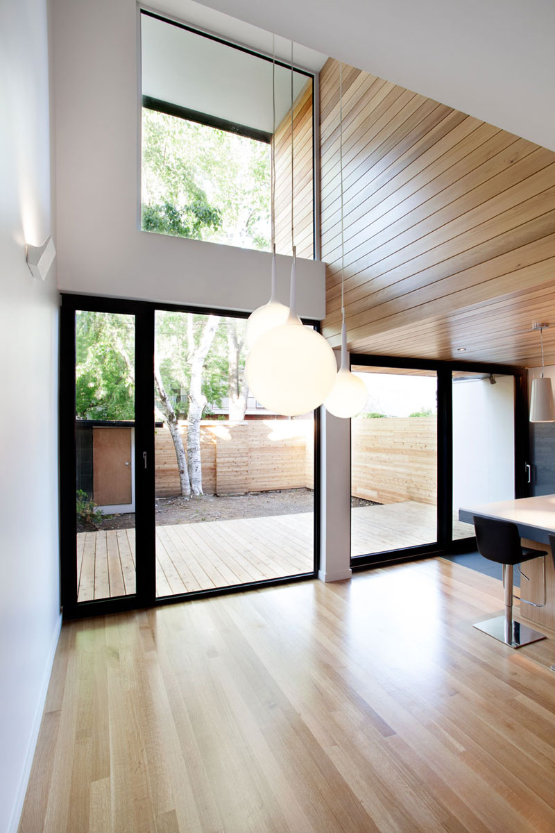
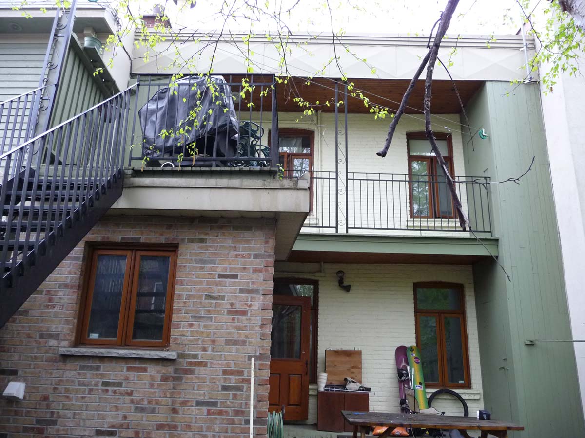
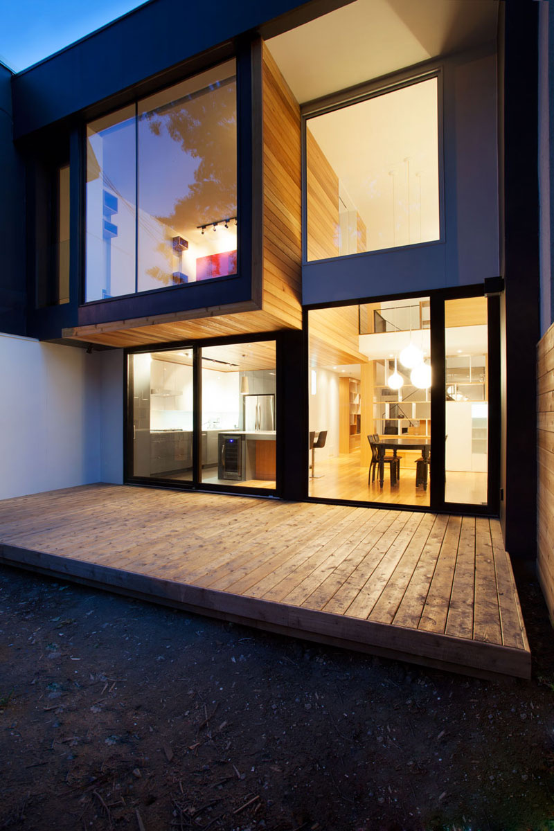
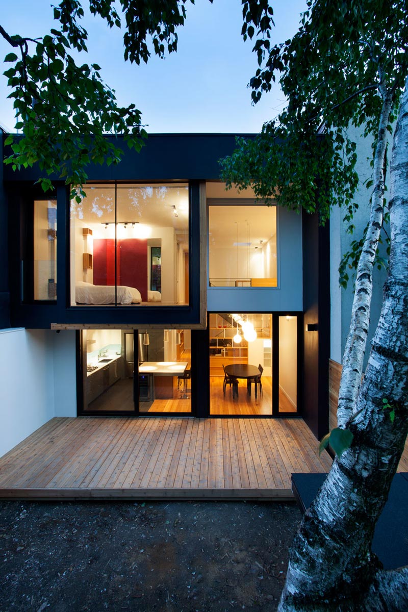
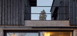
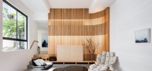
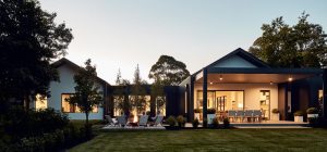
As the main bedroom juts out from the back facade, it creates a covered terrace. This private side is a distinctly light and modern form unrelated to the classic and heavy street elevation. The steel, expanses of glass, and wooden deck and siding extend inside to embellish the house’s scale and forms.
Before…
After…
Architects: Naturehumaine
Photography: Adrien Williams







share with friends