The Heathdale Residence by TACT Design Inc. presents an interesting suburban dilemma: preserve an outdated architectural archetype of the McMansion, or fly in the face of anything you’ve ever seen to create something entirely unique. I’ll let you decide which path they took.
The home occupies a modest plot of land in Toronto, and carries with it such a bold collection of material, formal and organizational anomalies it teeters on the edge between surreal revolutionary and utterly bizarre. It’s business in the front, party in the back, and gives the owners exactly what they wanted: equal parts privacy and exposition.
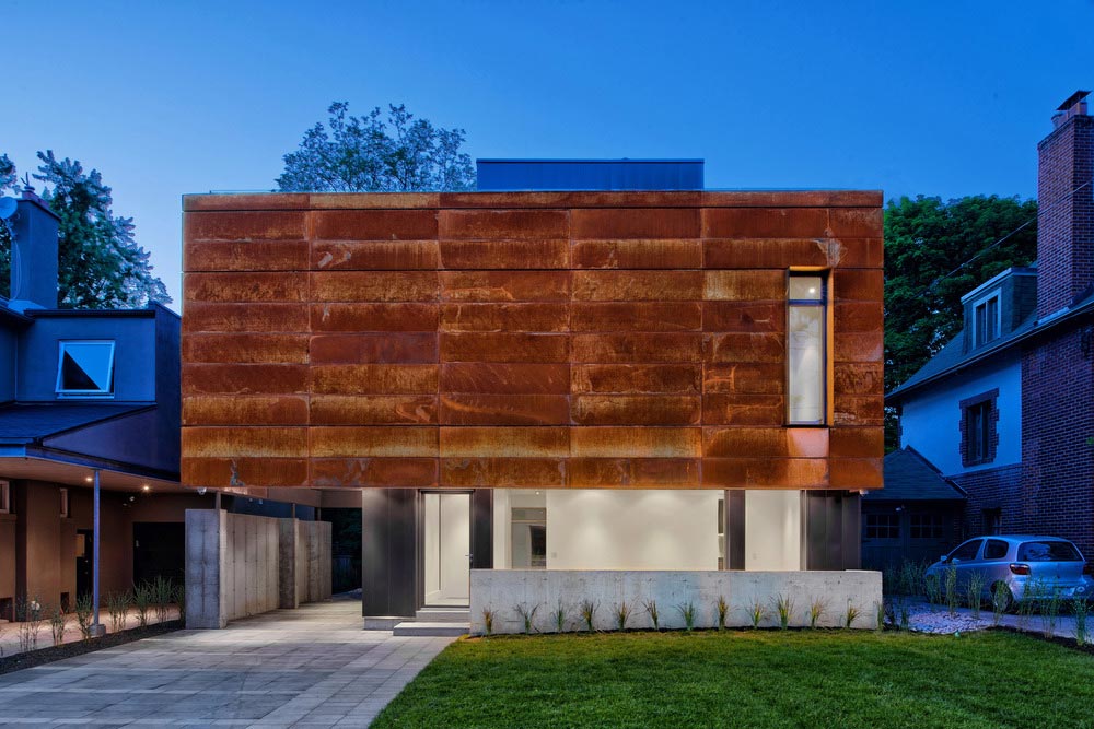
Let’s start with the former. From the street, The Heathdale Residence is anything but inviting. A large rectilinear blob of rusted steel and a single punched opening occupies most of the visual real estate. This massive formal expression sits atop a less conspicuous plinth with a veil of heavy shade provided by the cantilever above – masking any clear entry into the home. The composition is complimented by a minimal front yard that has been landscaped to provide vehicular and pedestrian wayfinding to the front door.
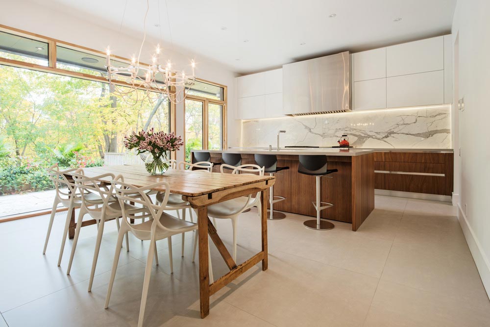
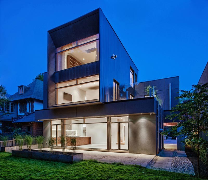
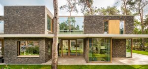
The rear yard, however, presents an entirely different set of design criteria. Each of the three main living floors open fully towards the back half of the lot. At the ground level, the kitchen marks the focal point of the public arena. A massive glazed opening creates a blurred edge between at the exterior threshold. Light, air, and exterior space flood the spaces, presenting a program that is wildly different than what can be found at the front. As an object, it’s an appropriate measure of yin vs. yang.
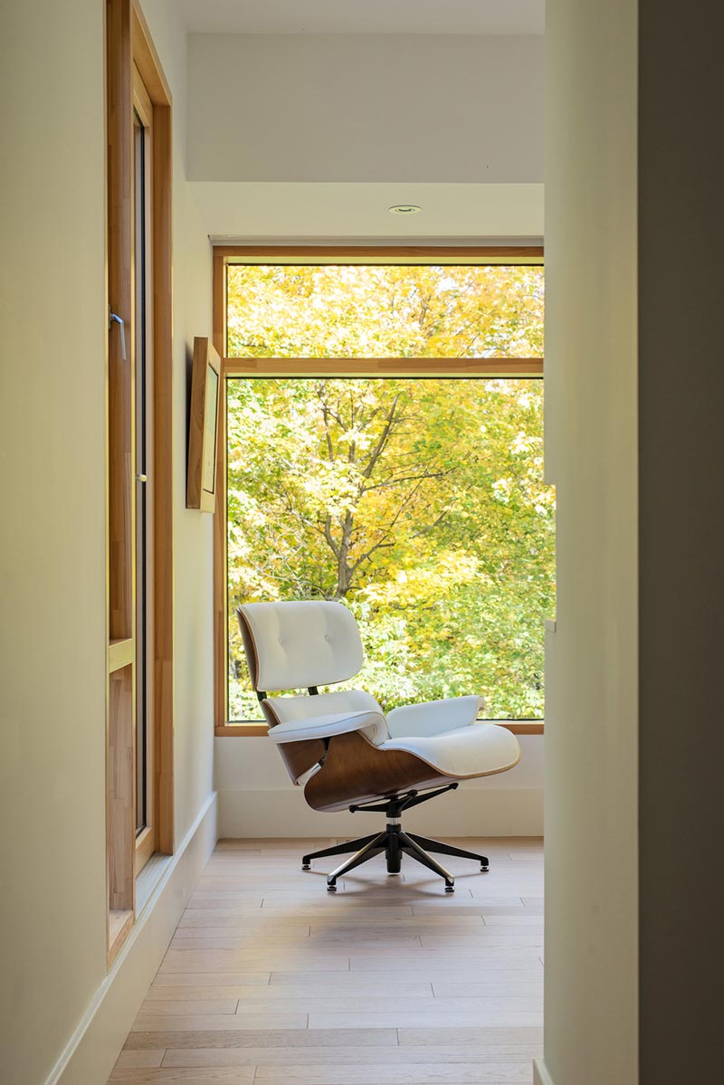
This is the challenge of designing a home within an urban environment: to get the most out of abundant natural resources and views without sacrificing privacy. One might argue the extreme line was drawn to create such a brash and protected facade as the Heathdale Residence does. “Welcoming” certainly doesn’t come to mind. But it’s refreshing to see the architectural and societal dichotomy of the single family home taken on with the boldness seen here. The exposition is there, it just has to be earned.
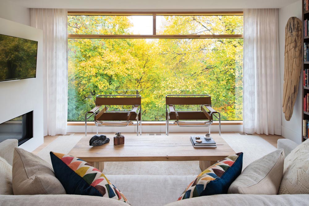
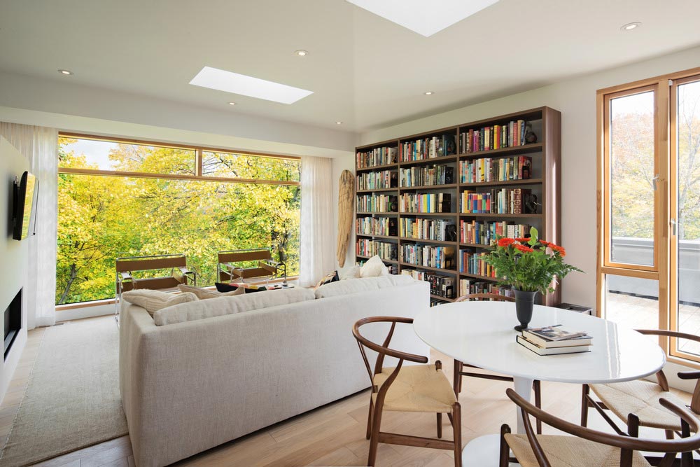
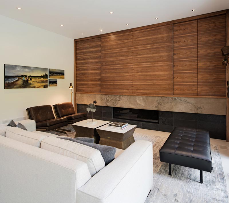
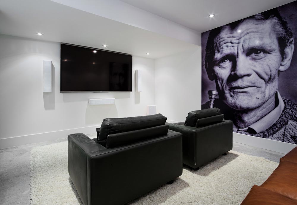
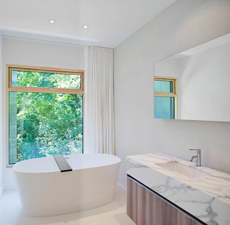
And once that entry is earned, the home is quite the experience to behold. Interiors are clean and minimal, highlighting the strong spatial relationships by subtle material expressions and neatly organized views to the outside. You’d be wise not to judge this book by it’s uninviting cover, because what lies in these pages is well worth the read.
Architects: TACT Design Inc.
Photography: David Giral



















share with friends